

What worked on paper didn't always work at classroom scale.
The challenge was improving visibility and interaction on large displays while preserving the instructional intent teachers depended on.
NDA PROTECTED


01
CHALLENGE
A classroom view has a different job to do.
The redesign had to balance four constraints without disrupting familiar teaching practices.
Screen size limitations
Large displays still have finite space. Key content needed to be visible without overwhelming the screen.
Important information was lost of competing elements distracted teachers.
Dense layouts
Print pages were information heavy with long passages, multiple callouts, and complex visuals.
High cognitive load and difficult scanning while teaching.
Legacy platform limits
We had to work within existing architecture, components, and publishing rules.
Limited flexibility in layout, interactions, and new patterns.
Teacher expectations
The experience has to feel familiar and maintain the instructional flow teachers already knew.
Any disruption risked adoption and teacher confidence.
Process
Shared decisions, applied screen by screen.
We shaped the system by working through exceptions together.
Design Handbook
With content partners, I defined what needed to stay consistent and where the system could flex. I kept those rules current in the handbook as product needs evolved.
Office Hours
I led weekly working sessions with engineering and content to resolve platform constraints and decide what should become reusable behavior versus a documented exception.
My role in scaling the system
I redesigned 5,000+ presentation screens from early concepts through commercial launch. I translated shared rules into flows, interaction patterns, prototypes, and detailed specifications, then partnered with content and engineering through design reviews, accessibility checks, implementation QA, and edge-case resolution.
the Solution
Designed for the screen, without losing what matters.

Print Materials
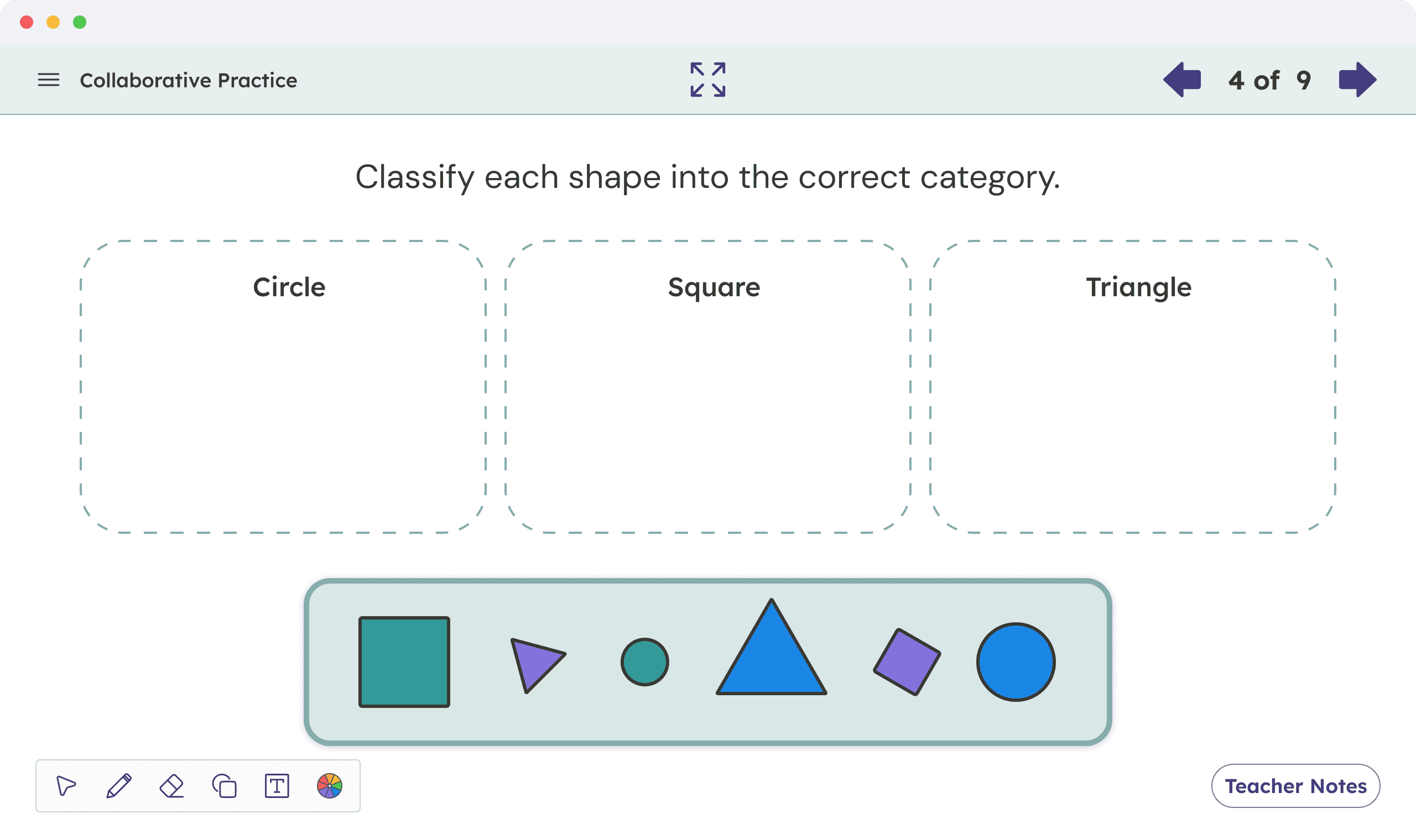
Presentation Experience
After observing teachers use the product in real time in their classrooms, I saw that they often bypassed the minimal beta in favor of familiar digital PDFs. That behavior reframed the commercial solution to preserve the print-based structure they trusted, then adapt it for classroom visibility, interaction, and platform constraints.
I turned that insight into a shared approach for 5,000+ screens.
04
Screens in Context
One approach, adapted to different teaching moments.
That shared approach shaped every screen, while each layout responded to a different instructional purpose.

Readable throughout the room
Emphasized the most important content and sized it for readability at a distance.

Support when it's needed
Revealed information progressively to reduce cognitive load and clutter.

Familiar patterns across lessons
Reusable layouts and components reduced learning friction and improved teaching flow.

Instructional flow presevered
Preserved familiar pedagogy, lesson sequence, and teacher control to maintain trust and instructional intent.
Impact
From minimal to familiar, capable, and scalable.
Beta → Commercial
The commercial release replaced the minimal beta with presentation screens that preserved the print-based lesson structure teachers already understood. Clearer hierarchy improved readability across the classroom, predictable navigation and built-in annotation supported live instruction, and reusable layouts and interaction patterns carried those improvements across 5,000+ screens, multiple grades, and varied content types.
Familiar by design
Print alignment fit established teaching workflows.
More capable in the moment
Predictable navigation and built-in annotation supported live instruction.
Built to scale
Reusable patterns supported thousands of screens, content types, and exceptions.
reflection
Familiarity can be a usability requirement.
Simplifying the beta removed cues teachers relied on. The commercial experience preserved familiar curriculum structure while adding digital support where it improved instruction.
Test continuity earlier
I would test if new concepts preserve the cues teachers rely on, not just whether individual interactions work.
Validate in the classroom
I would evaluate hierarchy, spacing, navigation, and interaction at classroom scale earlier in the process.